
Introduction
Updated June 2013 with latest temperatures and base period change to 1981-2010.
This paper asks the question: “Does the empirical observational data support the climate scientists’ computer models output?”. A top-down approach is taken – curve fitting, if you like. The intention is to compare the actual global temperature, through time, to the projected temperature as determined by the climate computer models.
In this paper, the following steps are taken:
1) Collect and plot the actual historical temperature data
2) Determine whether the trends in the historical temperature data show any repeatable cyclic behaviour, and if so, devise a mathematical formula that best describes those cycles. This formula would represent the natural (non-anthropogenic) climate changes
3) Enhance the formula to include any anthropogenic factors, if required
4) Determine whether the formula has any predictive power (ability to hindcast)
5) Compare the historical and formula-predicted temperatures, with those projected by the models
6) Determine the trend in CO2 levels, and attempt to predict the future concentrations, ignoring possible natural (e.g. volcano) and political/economic disruptions.
7) Determine the trend in sea-levels, and attempt to predict the future increases, based on current trends, and compare the resultant sea-level increases, with those projected by the climate models
Preparing the Observational Data
The term ‘global warming’ refers to the average temperature of the whole earth’s lower atmosphere (the lower troposphere) increasing, and so the surface or near surface global temperature data, from land and ocean, needs to be collected. This data should reflect as long a period as possible, because climate, by definition, spans multiple decades and centuries.
However, the temperature has only been measured globally since the start of the satellite era, from 1979. From 1850 to 1979, land station temperatures are available, as are a few ocean observations, but as the oceans comprise ~70% of the earth’s surface, this data must be viewed with caution. Prior to 1850, the use of proxy data (ice cores etc) are used to estimate the earth’s temperature backwards for millions of years, and is even more uncertain.
Multiple studies are available, from both hemispheres, of proxy temperature data for the last 5000 years:
The temperature data was mathematically averaged over the entire period (the dashed purple line in the above graph, Figure 1), but was also averaged by ‘eye-ball’ (the thick black line in the graph) to smooth the data and account for the non-temperature proxies (Tree line, MSL, O2 isotopes etc). Although the accuracy of the data (and the averaged result) is highly uncertain, it does support historical anecdotal evidence, especially over the last 2000 years.
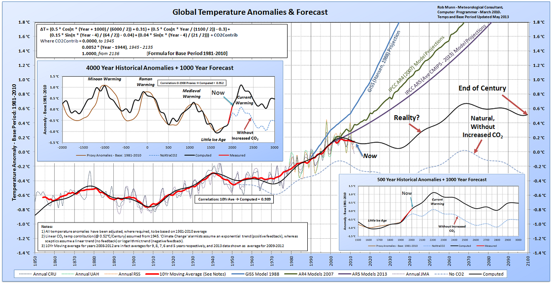
The non-proxy temperature data from meteorological stations world-wide (HadCRU3 , JMA and GISS) and from satellites (UAH and RSS), each averaged over 10 years (to smooth out short term ENSO and volcanic events), is shown below in Figure 2. Note that the years 2008-2012 are in fact averages for 9, 8, 7, 6 and 5 years respectively, and 2013 data shown as average for 2009-2012. These values will change as new data becomes available.
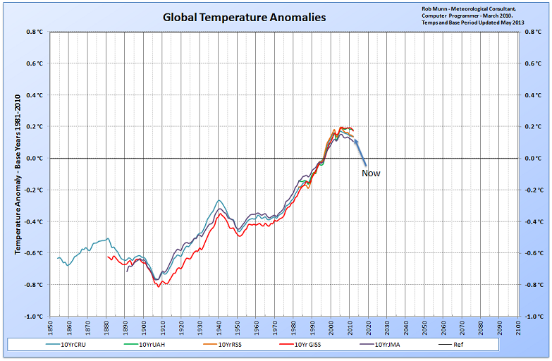
The GISS (NASA) dataset is clearly an outlier when compared to the other three datasets, and it is well known that the GISS data has been ‘manipulated’ over the years to show cooler temperatures in the 1960’s and 1970’s and higher temperatures in the 2000’s (compared to previous versions of their own datasets). As a result, the GISS temperatures are not used in this paper.
Analysing the Observational Data
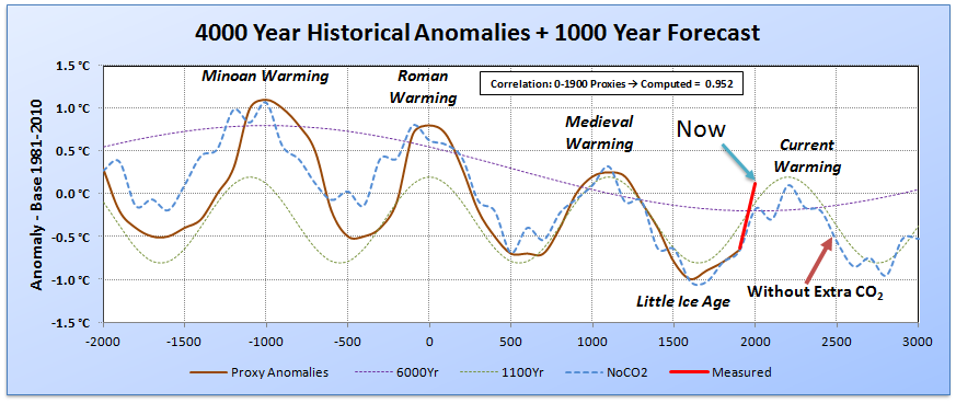
Analysing the long term proxy data, there seems to be a clear cooling trend over the last 3000 years suggesting a cycle of approximately 6000 years, with a peak circa 1200BC and a trough circa 1800AD. The data also shows a cycle of approximately 1100 years, with the peaks occurring during the Minoan (1100BC), Roman (1AD) and Medieval (1100AD) warm periods, the latter two periods being well documented in the history books.
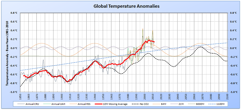
Analysing the temperature anomaly data from 1850 (based on the 1961-1990 average), there is a clear cycle of approximately 64 years (PDO/AMO), with a superimposed 21 year cycle (Hale Cycle).
Although one can guess at the mechanisms that drive the cycles (be they astronomical, ocean and/or indirect solar influences), this paper does not attempt to attribute causation. I’ll leave that to my far more learned colleagues. To know that night follows day, and that summer follows spring does not require knowledge of the causation mechanisms (earth rotating, which in turn rotates around the sun etc). If one can ‘see’ repeating cyclic patterns, one can make an educated guess that these cycles will continue to repeat.
A temperature anomaly formula was devised (also based on 1981-2010) that combines the cycles found above, to fit the global temperature plot. The long term fit (dashed blue line) is shown below in Figure 3, together the lightly dashed lines representing the 6000 year and 1100 year components:
and the short term fit (dashed black line, together with lightly dashed lines representing the 6000, 1100, 64 and 21 year components in Figure 4):
Both graphs show that the formula starts to under-estimate the temperature from the 1950’s. As mankind has indeed been pumping carbon dioxide (CO2) into the atmosphere since the industrial revolution, especially so since the end of the last world war, this discrepancy must be due (at least in part) to these emissions. To get the computed curve to fit the actual temperatures, an additional 0.0052°C per year needed to be added from 1945 onwards. This additional temperature increase was anchored to 1°C in 2136, as it is assumed that more efficient, cheaper, non-fossil fuel energy sources would be widely used by then.
The final formula (based on the 1981-2010 average), shown as an Excel function, is:
Public Function GlobalTempAnomBase8110(Year As Integer) As Double
    Pi = 3.1415926
    GlobalTempAnomBase8110 = (0.5 * Cos(Pi * (Year + 1000) / (6000 / 2)) + 0.31) + (0.5 * Cos(Pi * Year / (1100 / 2)) – 0.3) +
        (0.15 * Sin(Pi * (Year – 4) / (64 / 2)) – 0.04) + (0.04 * Sin(Pi * (Year – 4) / (21 / 2)))
    If Year > 1944 And Year < 2136 Then
        GlobalTempAnomBase8110 = GlobalTempAnomBase8110 + 0.0052 * (Year – 1944)
    ElseIf Year >= 2136 Then
        GlobalTempAnomBase8110 = GlobalTempAnomBase8110 + 1
    End If
End Function
This formula, when plotted against the global temperatures, gives:
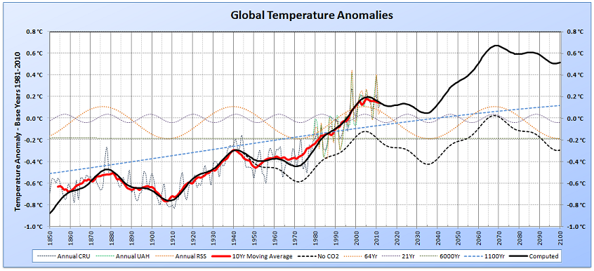
The correlation coefficient between the computed temperature and the 10 year moving average temperature is 0.989, which is an excellent fit.
The IPCC temperature projections made in 1988 and 2007 have been superimposed on the graph (see Figure 6 below), and clearly show how removed from reality they are:
Analysing the Effect of CO2
Assuming that the additional 0.0052°C per year from 1945 is due to CO2 alone, it should be possible to deduce the effect of a doubling of CO2, given by the IPCC as between 2°C and 4°C.
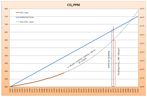
In 1944, the CO2 level in the atmosphere was 300 ppm (parts per million). When the CO2 levels are plotted and extrapolated to the year 2100 (using a three-order polynomial), it is seen that in the year 2070 (approximately), the CO2 level would have reached 600 ppm, twice the level seen in 1944.
Adding a plot of 0.0052°C per year to the graph from 1944, shows that in 2070, when the CO2 doubling is forecast to occur, the forecast temperature is only 0.65°C above the natural temperature level. Given that mathematically (MODTRAN), a doubling of CO2 leads to a ~1°C rise in global temperature, this suggests that a negative feedback is in effect, i.e. the extra warmth due to CO2 is being counteracted by some other cooling phenomenon (clouds?).
What About Sea Level?
As the above research has shown, global warming will probably continue at a leisurely pace for the next 200 years (reaching perhaps 1.1°C above the 1981-2010 levels by the year 2200). It would then be safe to assume that sea level rises should continue to rise at the same pace:
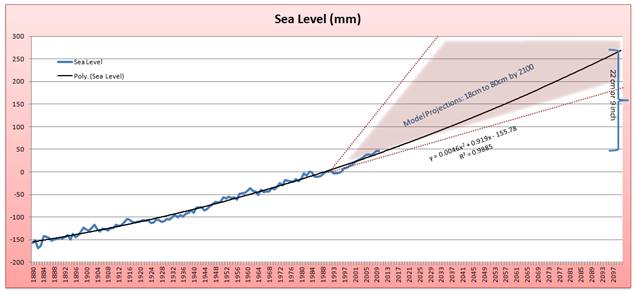
Extrapolating the sea level (Church and White (2011)) using a two-order polynomial, the sea level should be about 22 cm (9 inches) above current levels, by the end of the century. This level is within, but towards the lower end of, the IPCC sea level projections.
Conclusions
1) The historical temperature data does indeed show repeatable cyclic behaviour, with the correlation coefficient between the computed temperature and the average 10 year temperature being 0.989.
2) This high correlation coefficient indicates that the devised formula has good predictive power.
3) The global temperature anomaly projections (2 to 4°C by 2100) from the 2007 AR4 and 2013 AR5 computer models have no predictive power. They seem to assume a linear projection of the 1990’s warming through to the end of the century.
4) Based on current temperature and CO2 trend data, a doubling of CO2 should increase the global temperature by only 0.65°C, not the 2-4°C posited by the climate models.
5) The sea-level is predicted to rise a further 22 cms (9 inches) by the end of the century. Mankind can easily adapt to this small increase. Forecasts of > 1 metre are exaggerated.
Advert, when I can afford to publish: CLIMATE CHANGE – Beyond the Politics
I’m a bit of a passive activist, i.e. not the sort that joins demonstrations waving banners, shouting slogans. But I do want to get the BAGW (Beneficial Anthropogenic Global Warming) message out, so I figured that if I ever had a decent win at lotto, I would place a full-page advert in the local newspaper (in my case, The West Australian). I’m still waiting for the cheque from lotto, but here’s what I had in mind.
I am assuming that the reader is not a scientist, so the prose is a little simplistic. I’m keeping well away from any political slant.
CLIMATE CHANGE – Beyond the Politics
Do you believe in Climate Change? Yes?
So do the ‘sceptics’ and ‘deniers’ – climate is, and has been, constantly changing.Do you believe in Global Warming? Yes? So do the ‘sceptics’ and ‘deniers’ – it has been warming for the last 400 years, and 0.8°C since 1850.
Do you believe that humans have contributed to this warming? Yes? So do the majority of ‘sceptics’ and ‘deniers’ – CO2 has undoubtedly warmed the planet, it is a ‘greenhouse’ gas, and its effect is generally accepted as ‘settled science’.
Is the current global warming going to prove ‘catastrophic’ in the future? This is where the uncertainty lies. The UN’s IPCC (Intergovernmental Panel on Climate Change) ‘consensus’ and the current government believe the current warming will continue unabated, to reach between 2°C and 4°C (or higher) above current temperatures by the end of this century. However, for the last 10 years the temperature has stopped rising. We all know that the earth’s weather occurs in natural cycles (and climate is the average of the weather), from daily warm/cool cycles, to yearly warm/cool cycles. We also have longer climatic warm/cool cycles, like the ENSO cycle (El Niño/La Niña, every 4-7 years), the Hale Cycle (~21 years) the Pacific Decadal Oscillation (~64 years), the cycle between the Roman, Medieval and current warm periods (~1100 years) and the cycle between the major ice ages (~120,000 years).
The climate is currently recovering from the “Little Ice Age” ( the cold period between the Medieval and current warm periods, 1600-1800), and we have just passed the maximum (as of 2005) of the current Pacific Decadal Oscillation (~64 years). The present global temperature appears to be entering a cooling phase,
and if history is a guide , should continue to be slightly cooler for the next 20-30 years, before warming slightly again (see graph below).It is agreed by both the IPCC scientists and ‘sceptics’ that a doubling of CO2 into the atmosphere will only raise the global temperature by about 1°C,
directly . The difference in opinion concerns the ‘side-effects’ (positive and negative feedbacks) of the 1°C rise.Simply put, the IPCC and government think that it will get warmer still as more water vapour enters the atmosphere due to evaporation, and water vapour is a much more effective ‘greenhouse’ gas than CO2, resulting in ‘run-away’ temperatures.
The ‘sceptics’ agree that more water should enter the atmosphere, but suggest that more cloud will form as a result, reflecting more incoming radiation (heat) from the sun back into space, thereby cooling the earth, operating like a thermo-stat. We all know that the earth has experienced cataclysmic events in the past, such as meteor strikes and major, violent volcanic eruptions, and the earth’s climate has always recovered, suggesting that the climate is inherently stable, or self-regulating. A minor 1°C rise in temperature from a CO2 doubling is extremely unlikely to cause a ‘run-away’ temperature rise.
However, the science is extremely complex, and admittedly not well understood by either side of the debate. The empirical evidence (i.e. the global temperature) suggests that the future temperature projections of the climate computer models are way off mark (see graph below). If observations don’t match projections, then the projections (and the theory behind those projections) are
wrong . Regarding the politics and policies based on this theory? That’s for you to decide. Just remember that the ‘Precautionary Principle’ is counter balanced by the ‘Law of Unintended Consequences’.